About
You wish to eat healthy and enhance your overall wellness. You care for others and want them to be healthy as well. The challenge is how do you find and compare foods reliably? Then where do you buy them?
Everything Food is an online platform empowering people to make informed food choices. We enable you to search & compare food products using our Everything Food Quality Score (EFQS), an intuitive food quality scoring system.
The Design Challenge
Everything Food wants to roll out new nutrition/diet plans from dietitian Mascha Davis that would work best with current and new customers. As well as understand what’s the most important next steps for them to plan for based on the user research.
The Solution
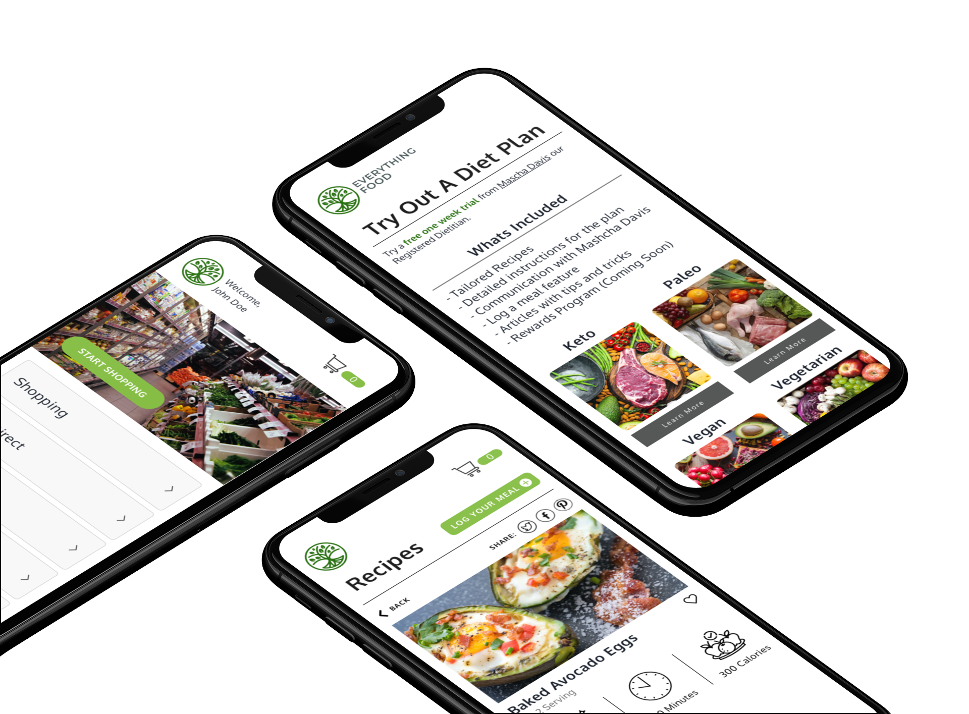
In order to met the business goals and our users needs we came up with to integrate the nutrition plans into the onboarding process. As well as create a section for users to browse recipes that are for that nutrition plan, and enable the user to exclude things like diet restrictions and allergies. Lastly adding in a new feature for them to log meals to help track and stay up to date with the plans goals.
Role
UX Designer / Visual Designer / Content Strategy
Client
EverythingFood
Duration
3-Week Sprint
Team
Kyle Houston, Blair Morgan Reeves, Serge Pikhotskiy
Platform
Mobile
Tools Used
Sketch, Miro, Slack, Google Docs, Invision, Zoom, Usertesting.com

Research
We began with a competitive analysis, where we looked at other diet programs in the space to get an understanding of what users wanted from a nutrition/diet plan as well as see what the competition was currently doing. For this we looked at Noom, BeachBody, Yummly and Weight Watchers.
We looked for industry standard features to help customers feel more comfortable with features, layouts and interfaces they are a custom to seeing. This helped us brainstorm features that would help Everything Food stand out in this competitive marketplace space for dieting.
User Interviews
We used this information to help craft questions for our research goals and objectives. We were able to interviewer eleven users both male and female, varying from ages of 25-60 years old for this project. The research goals we had going into these interviews were to discover why a user would want to start a diet plan what motivation if any were factors, what success in a plan or program would look like to them, and what a user wanted to gain or get from a plan ultimately.
Some other considerations we wanted to find out how were people finding a plan, was it word of mouth, social media, or maybe even the news. We also wanted to know if the user felt the price point for the plan matched the value they were getting in return, and what their expectations were when trying a new plan out for the first time.
We took these finding into our affinity map and became to pull our key insights from the interviews.
Key Findings From Affinity Map
Many wanted to be able to establish a connection with an online community who were involved in similar nutrition plans as a way to provide accountability and support.
We found that users wanted a way to customize their plans based on their food preferences and dietary restrictions. Along with that, users wanted to see recipes that aligned with their custom food preferences.
Being able to track their progress in their current plans was something that users really liked.
Many enjoyed the gamification that their plans had included as well, such as badges or streaks, for achieving something good. This helped them feel motivated and to stay on track with their goals.

Developing Our Personas
After finishing our affinity map we moved to create our personas. We interviewed a wide age range of participants and discovered that there were two types of users - someone new to a diet plan and a more veteran user that has used some diet plans before. This lead to our users problem statement below.
Matt and Casey need a platform that would help them form better eating habits, because plans they’ve tried in the past failed at helping them achieve their goals and desired results.
Ideating On Features
Now that we know what are users (Matt and Casey) are looking for in a plan we began brainstorming and did a design studio to come up with ideas for features.
Some of the features we realized from our research were customization nutrition plans, a support group function for the user to interact with others. Being able to select food preferences and align those to the recipes that are available in the plan.
Lastly tracking progress for the user to see where they are in the plan as well as gamification to keep the user engaged in that plan. Our minimum viable product for this was the integration of the nutrition plans to function with there preexisting products and recipes that are available on the website.
User Flow
Before we could jump into the design, we wanted to consider what the flow would look like for both a new user (Matt) and a returning user (Casey). If you’re a new user like Matt, we wanted to explore what the onboarding process looked like while considering how to introduce the nutrition plans in a way that enticed users to try out this new offering. For a more veteran user like Casey, we wanted to introduce new features, such as being able to log a meal, which would greatly enhance her overall Everything Food experience and would prompt her to come back to the site on a daily basis.
Wireframing
With the user flow blueprint we set out to create our first iteration of mid fidelity wireframing. Using their current style guide and layouts I began integrating our features into the onboarding process and the logged in user home screen.
Pick A Plan Onboarding
Preferences Page Onboarding
Recipes Home Page
Recipe Card
Testing & Iterating
We then tested with five people in a moderated setting over Zoom. Using these user tests as a way to validate or invalidate our designs and found that all five users preferred the term nutrition plan versus diet or lifestyle. We also discovered that users didn’t mind having the plans presented to them up front as part of the onboarding process. Here are some examples of what we updated in our first round of mid fidelity to than test with Usertesting.com tool that Everything Food uses to validate in an unmoderated setting.
Onboarding Process
One of the biggest challenges we faced with the onboarding process was articulating the value of these plans in a way that is scannable. In our first iteration on the left, users were skipping over the paragraph up at the top. To solve this problem, we made this information more digestible (as seen on the right).
Select Plan Onboarding Screen
Dashboard Home
During testing users were expecting to see some indication that they were now on their personal account page after sign up. We solved this by adding a greeting along with the user's name at the top to make it clear that this was their account and that the user was indeed signed up. In the original design on the left, we had a section called ‘recipes for you’. Users found this confusing as they assumed the categories below would already be tailored to their plan. Since this was an unnecessary function, we removed it in the updated wireframes. Users also noted that they wanted the ‘recipes’ and ‘log a meal’ buttons on the dashboard page and not in the ‘more’ section, so we added it to their profile page (as seen on the right).
Logged in Dashboard/Home Screen
Log A Meal Feature
The icons used for the different meals shown on the left screen felt unnecessary to users and they actually preferred some kind of list so they could quickly see their entire day. For a solution, we referenced apps like MyFitnessPal to gather inspiration and insights into what set up is familiar to users when logging a meal. What we came up with is shown on the right - a list set up that combines what we already had with what we discovered are industry standards.
Log A Meal Screen
High Fidelity Mobile Mockup

Client Outcomes
The client was very pleased with what the team and I came up with. They were extremely impressed with the level of fidelity and detail we were able to produce. Our next steps we explored and presented were also well received and they were shocked about how much we thought of in such a short amount of time.
While working in an agile environment has its challenges especially when we working remote only atmosphere, this was a great opportunity to prioritize the most important features based on user insights and research so we could create the best product possible that not only kept user’s needs in mind, but that met with Everything Food’s business goals as well.
Recommended Next Steps
Support Group
Having a support system was voiced by our user interview participants as a crucial feature for success of sticking to a plan, we thought it would be valuable for Everything Food to create this as an exclusive feature for their nutrition plans as it would help maintain customer retention and create a more positive experience for the user.
Obviously there are some technical hurdles that would need to be explored further in order to gauge the full scope as we know users would ideally like to be paired with others doing the same plan that they are. Location could also play a factor into this as if they were in the same city they could build relationships/ have local events. We also imagine that there would need to be a database on the back end at Everything Food for this to happen.
Progress Tracker
We also discovered, that tracking progress has been proven to be another valuable tool to a user’s success. Because of this, we came up with what we believed could be the start a way for Everything Food to gamify their nutrition plans and other services they offer.
The idea we had was to utilize the Everything Food logo - specifically the tree portion. The leaves would become points users could earn every time they logged a meal, shared a recipe on social media, or sent a message to their support group. Over the course of a week for example, the tree would grow or gain leaves based on the number of leaf points the user earned, which they could turn in for a reward.


