About Lime
Lime was founded on a simple idea that all communities deserve access to smart, affordable mobility.
Through the equitable distribution of shared scooters, bikes and transit vehicles, we aim to reduce dependence on personal automobiles for short distance transportation and leave future generations with a cleaner, healthier planet.
The Design Challenge
Lime wants to set the standard for motivating good behavior. Therefore, the company is also looking for technology solutions that help educate and encourage people to do the right thing (as in having proper scooter etiquette), rather than punishing them for doing the wrong thing.
The Solution
We came up with three main points to hit on for our solution to this project Incentivize, Notify, and Empower. Through these three pillars we were able to create a creative solution to tackle the problem.
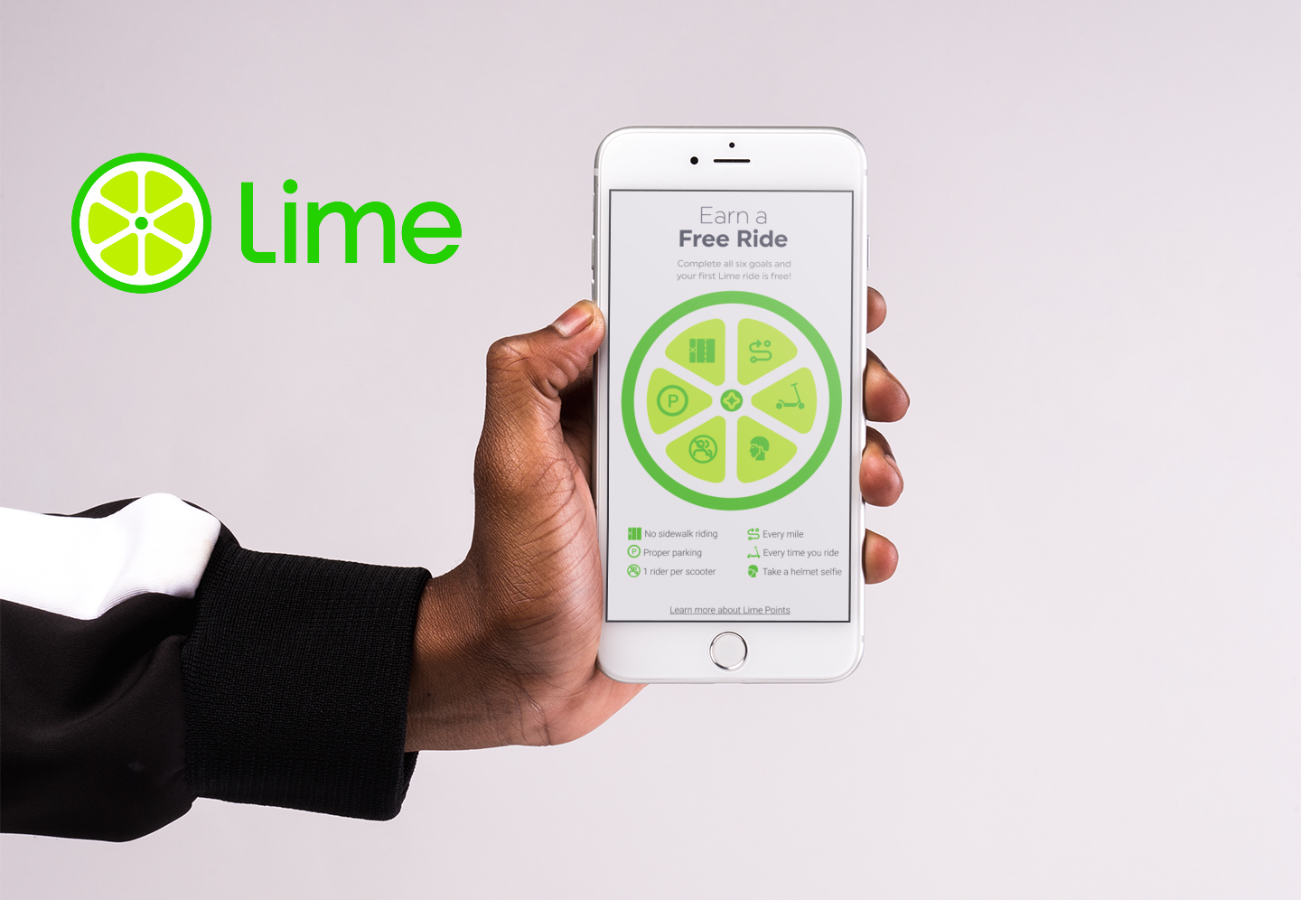
We first created a loyalty program to reward the good behavior and show the user that was doing something wrong that they were missing out on rewards. Secondly, we added screens for notifying the user about possible issue on the ride, for example a no parking area or scooter dead zone. Lastly, we empowered the user with using a GPS system that would route them on safe roads and areas to their destination.
Role
UX Designer / Interaction Designer / Content Strategy
Client
Lime
Duration
2-Week Sprint
Team
Kyle Houston, Alex Ripberger, KC Morris
Platform
Mobile / On Board Scooter Screen
Tools Used
Figma, Miro, Slack, Asana, Google Docs, Zoom

Starting The Research
Before we jumped in we first set out to understand more about Limes customers by doing research online about Lime and the background of why users would use them. We found that this product would be for anybody that's a first time or repeat customer, trying to use an electric scooter to get around the area. A person that is on the go and needs to get to a destination quickly instead of calling a cab or waiting in traffic to get to where they want to go.
Listening To Our Users
Once we understood our users, we could start to build our research plan to start identifying the main problems the users faced when using the app.
We began with a competitive analysis, where we looked at other ride share apps including Uber, Lyft and Bird a direct competitor. Looking to see how they rewarded users as well as making sure they were following correct laws and rules. Along side this we found various trials that were going on within Lime for side walk riding as well as other cities allowing trials to see how they would function in the city. We used this information to help craft questions for our user interviews.
We were able to get five user interviews for this project. We tried to figure out if users actually knew what proper scooter behavior was. As well as if they understood what bad scooter etiquette was. Lastly our other main point to find out was if the user has broken the rules before or if they would and what was the situation that would occur. We took that information into our Affinity Map to start to find patterns.

Developing Our Persona
After finishing our affinity map we created our users journey map which lead to developing our persona. Lucas is the persona we arrived upon as he is a middle aged working user that would most likely use Lime scooters to help with his commute to work. We believe he would do this to try and save some time on that commute so he can spend those extra few minutes with his loved ones.
Ideating On Features
Now that we had identified the core concerns, we needed to address them. Some examples of these concerns were not knowing the area well when using the scooter, or where it would work to avoid dead zones, and knowing the safety rules. We listed various features that the app could include, and grouped these features according to their level of importance in producing the minimum viable product. To refine our conclusions, we collaborated within our group to make sure they would align with the business goals of Lime. After much back-and-forth, we settled on features that the app “must have”, “should have”, “could have”, and “won’t have”.
Incentivize
Notify
Empower
User Flow
During our talks we constructed a rough user flow to understand where we wanted to interject these key features. Starting with the current apps user flow we tried to see where adding in the features would make sense and not become a burden or distracting from the users goal of getting riding the scooter quickly. With that in mind we added some notes to to make sure we solved for when moving over to the wire framing.
Wireframing
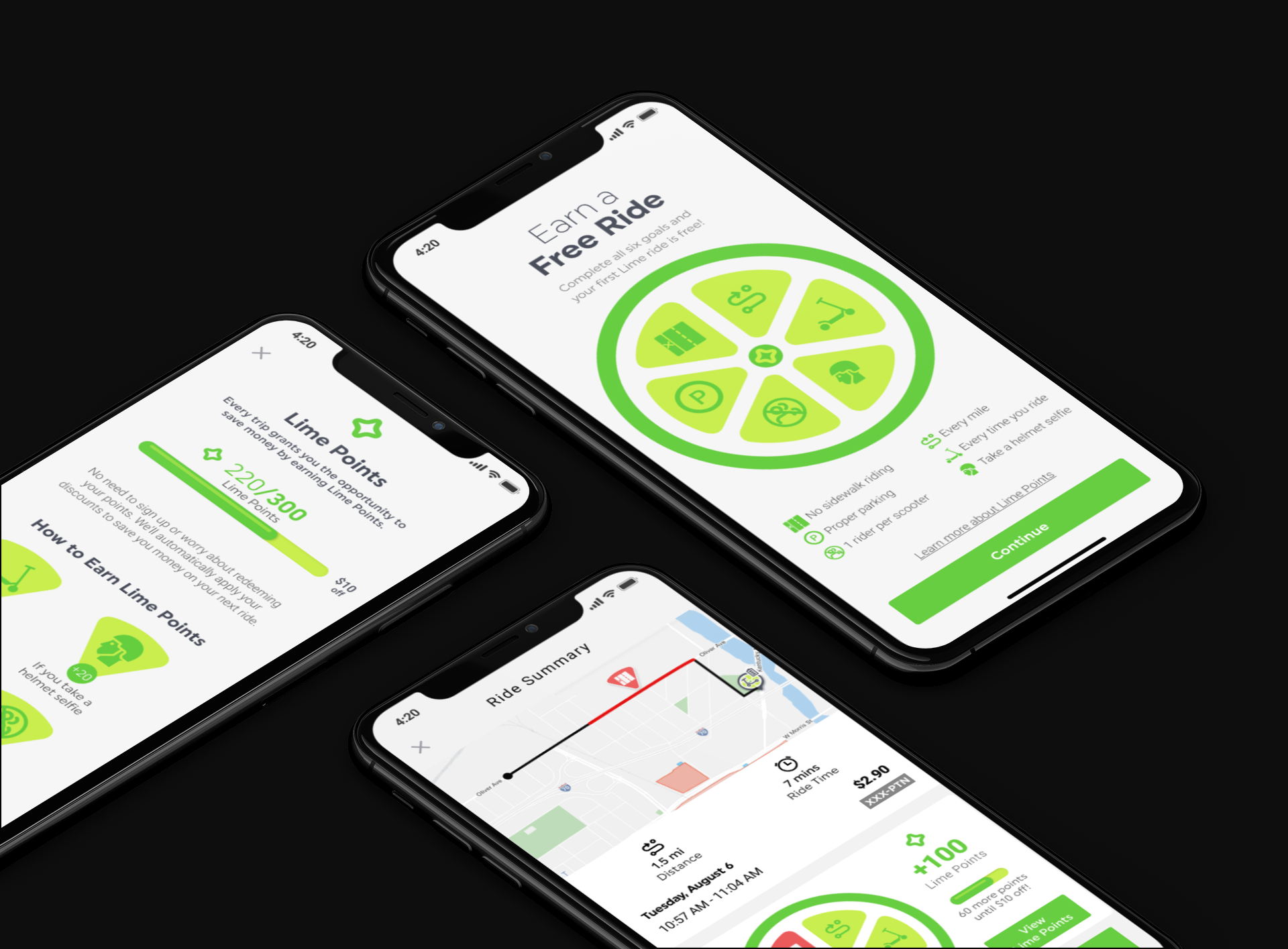
With the user flow blueprint we set out to create our first iteration of mid fidelity wireframing. We started with a design studio to help brainstorm ideas for the screens we would like to create. The main screens we focused in on were Lime points for our rewards program, a GPS directions similar to Uber or google maps and a ride summary page for overview of the trip.
Lime Points Info Page
Add GPS Destination
Directions Info And Turn By Turn
Ride Summary Page
Scooter Screens Wireframes
During our research we found out the Gen 3 Lime Scooters had on board display screens. We decided to incorporate them into our designs so the user(Lucas) would be better notified of things happening. For example when they couldn’t park the scooter in that area they would get an image that says no parking. The current scooter screens only show the speed in which the user is going on the scooter. With these concepts and ideas in hand we set out to find users to start our usability tests on.
Directions Screen
Low Battery Screen
No Parking Screen
Sidewalk Detected Screen
Testing & Iterating
We needed to test the app immediately in order to get user feedback. We conducted a total of four usability tests. Based on our observations and user feedback, we iterated on our design. Here was some of the highlights we determined from our usability report as well as the system usability score (SUS).
Indicating what the red line means on Ride Summary map, and add a Start and End icon to Ride Summary Map
Ride Summary Page
Ride Summary Page
Changed Lime Points info for easier readability and incorporated the lime logo into that point system with ride summary screen showing pieces for each of the lime points
Lime Points Page
Lime Points Page
On Ride Summary Page, Add an X or Close button to dismiss the Ride Update Sidewalk Alert card
Ride Summary Page
Ride Summary Page
High Fidelity - Scooter Screens
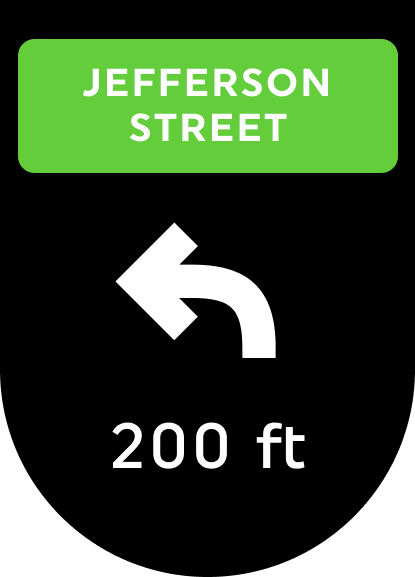
Updated on board screens for the 2.8” LED screen to allow the user(Lucas) to easily see directions to the current destination if they entered one. We were also wanted to think of what issues might possible arise when using the scooter that could be displayed on this screen to notify the user. We tested the screens to make sure they were able to be seen at a quick glance. We did this by flashing the screens in a half second interval and asking the user what the screen was for. Here are some examples of those screens we created.
High Fidelity - Mobile Mockup

Outcomes
By focusing on our users(Lucas) we were able to create effective solutions and keep the user in focus for our design choices. Making it so the user readily saw the benefits to following the correct rules and regulations we feel will improve people's behavior with the scooters. Which we hope this will change the way people's view of them in their area for the better.
We also tried to add useful features so the user(Lucas) felt empowered. An example of this is the add destination feature that would give them a GPS route and stay clear of areas that were unsafe for scooter travel or dead zones that the scooters were not allowed to operate in.
We made the scooter app lock when in motion so the user(Lucas) wouldn’t be on his phone and become a distracted driver. Instead we implemented this on the scooter display screen which makes it so they can see GPS directions without using the phone.
Recommended Next Steps
First would be determining what noises or notifications would work best when sending them through the scooter speakers this will help keep the user notified.
We also considered the idea of using the scooter’s sensors to detect potential unsafe driving patterns or drunk driving.
Finally, one of the ideas that intrigued us the most was the possibility of adding lockable helmets to the scooters, providing everyone with the opportunity to protect themselves against that worst case scenario of dealing with a crash this will help keeping the user empowered.


